BI
Taekwondowon BI connotes the aim of
Taekwondowon for 'Creating New Taekwondo Culture'
and the value of taekwondo, the prime cultural icon of Korea.
- To ensure the consistent image of the watermark, strict management is required and arbitrary deformation is prohibited.
- In principle, the watermark cannot be used if it is smaller than the standard size of 12mm as below.
-

[ Basic Type ]
-

[ Application Type ]
The mysterious Oriental energy that dwells in taekwondo and the dynamism of taekwondo have been expressed through powerful brush strokes.
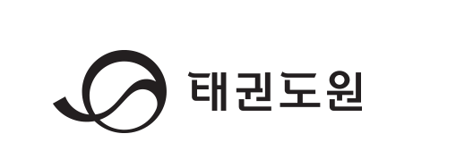
The symbol mark that is the most significant element symbolizing Taekwondowon expresses dynamic energy and reserved motions by taking Taekwondo movements and uniform belt as motifs. The color black which best represents Taekwondo has been applied to the symbol mark to stress the heightened status of Taekwondowon as a pivotal point of cultural exchanges of Taekwondo.
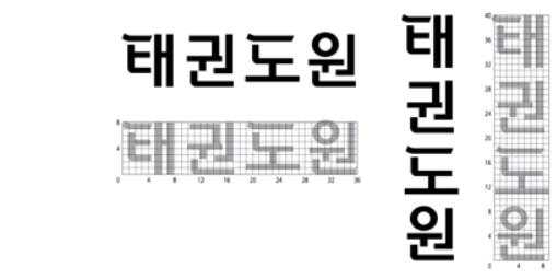
Along with the symbol mark, the Korean logo type which is another important element representing Taekwondowon embodies the first stroke of characters ‘태 (tae)’ and ‘도 (do)’ with Taekwondo uniform belt as a motif. The straight font was used to depict controlled movements and energy of Taekwondo.
-
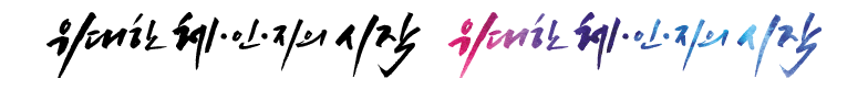
[ Calligraphy ]
-

[ Korean ]
-

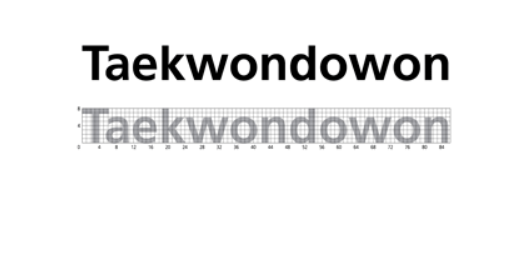
[ English ]
The slogan concisely expresses the determination of Taekwondowon both internally and externally while implicitly conveying wonderful experiences people will have here through changes in mind and body. Our slogan was developed in Korean and English by linking with unique calligraphy and logotype.
-
[ Horizontal ]
-

[ Vertical ]
The signature is a horizontal/vertical combination, following fixed regulations, of the symbol and the logo type, the most essential elements representing Taekwondowon. Versions with Korean letters, Chinese characters, and English letters were developed, allowing the fitting version to be selected according to the layout and use of the application medium.