Promotions
CI of Taekwondo Promotion Foundation
Taekwondo Promotion Foundation Visions and Values
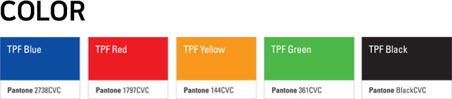
The new word mark of Taekwondo Promotion Foundation was made to promote and spread Taekwondo, which has taken root as a global martial art. The logo type is surrounded by an ellipse that uses unique five cardinal colors of Korea while symbolizing the Five Oceans. With a dynamic and progressive shape, the CI expresses global Taekwondo spreading out to the Five Oceans and the visions and values of Taekwondo Promotion Foundation distributing Taekwondo.
Watermark
In principle, the watermark cannot be used if it is smaller than the standard size of 12mm. The watermark image shall not be damaged by drawing a line.
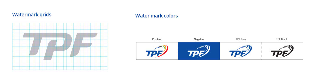
Logo type
Along with the watermark, the logo type is an important and basic element that conveys the image of Taekwondo Promotion Foundation. The logo was designed to match the watermark image, and the proportions have been adjusted according to font. Font type, thickness and proportions cannot be changed arbitrarily.As the logo type is an important and basic element that forms the image of Taekwondo Promotion Foundation, it shall be managed thoroughly and used accurately in accordance with the regulations set forth in this design guide.
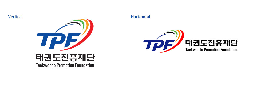
Signature in Korean and English
The signature is used to actively unite the image by combining the watermark and logo type. It can be selected according to the situation. We recommend the Korean and English version presented here.