Promotions
Taekwondo Brand
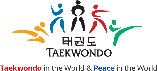
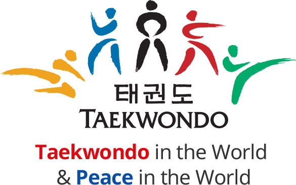
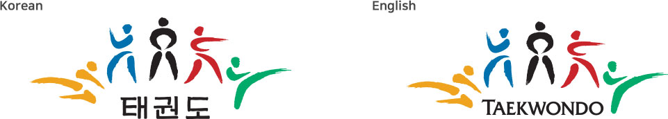
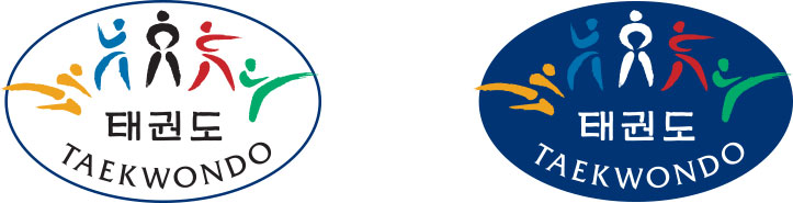
Meaning of the symbol
Looking at each letter of the word Taekwondo, ‘Tae’ refers to the feet, ‘Kwon’ refers to the fists and ‘Do’ refers to the method or rule. When combined, the word can be interpreted as the method of making a peaceful world by stopping quarrels through the proper use of body parts. This meaning was illustrated as a blossoming flower to describe Taekwondo in the World and Peace in the World.
Meaning of colors
Yellow, blue, black, red and green colors are the same as colors used in the Olympic flag. This means that Taekwondo is of the people, for the people and by the people around the world.
Example of using brand
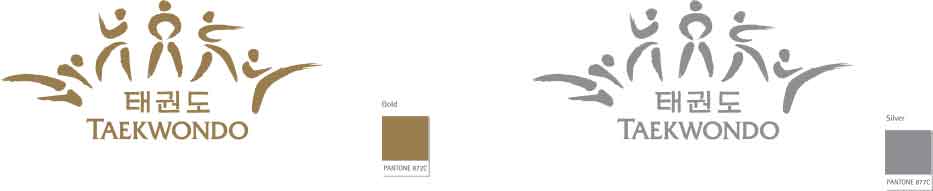
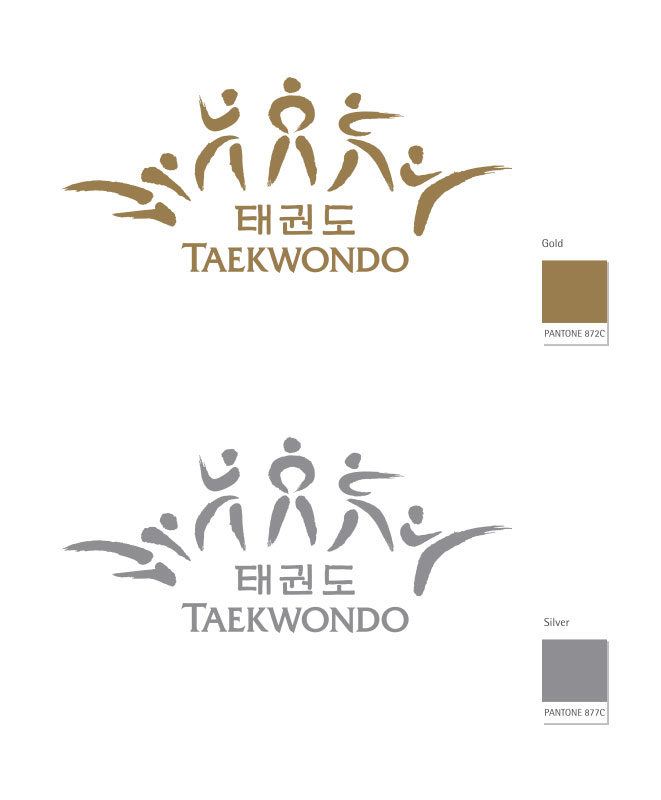
The symbol mark is an element that best reveals formative characteristics and symbolism of the Taekwondo brand. The Taekwondo brand prioritizes the use of the basic symbol mark that combines Korean and English. However, the utility type can be used partially for promotional items that are intended to spread the Taekwondo brand. The regulations and rules for the symbol mark must be followed to prevent damaging of the image from identity distortion, deformation and abuse.
The Taekwondo Brand places priority on the use of a basic symbol mark that combines both English and Korean. However, only promotional items that have the function of spreading the Taekwondo Brand can use the utility-type symbol mark.
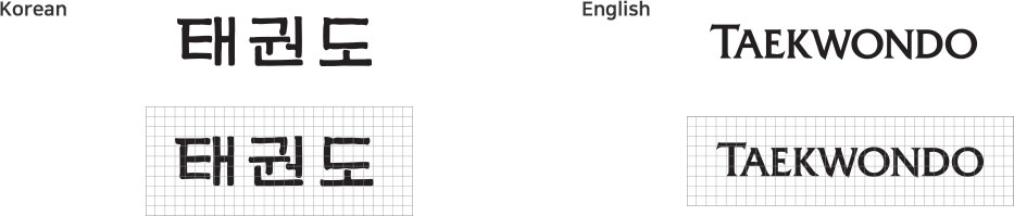
Along with the symbol mark, the logo type is another important element in terms of conveying the image of the Taekwondo Brand. As it was designed to look harmonious with the image that the symbol mark portrays, the proportions have been set in accordance with the shape of each font. Thus, the font, thickness, and proportions of letters should not be arbitrarily changed.
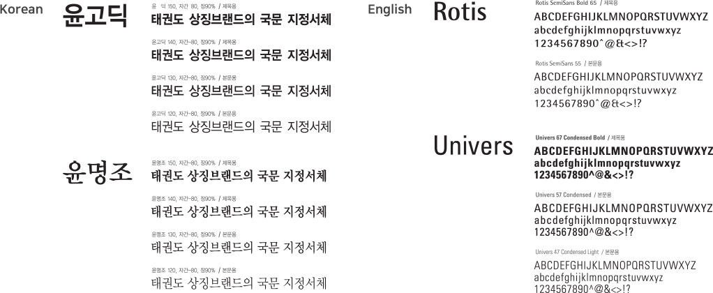
Designated fonts can be selected and used in accordance with the nature and content of the media, thus allowing a consistent identity representation.
When combined with the symbol mark, the emblem conveys the unique value of the Taekwondo Brand and maximizes the communication effect.


The character of Taekwondo Brand was designed to look harmonious in consideration of the symbol mark image based on the representative actions of Taekwondo Poomsae.
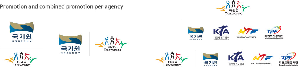
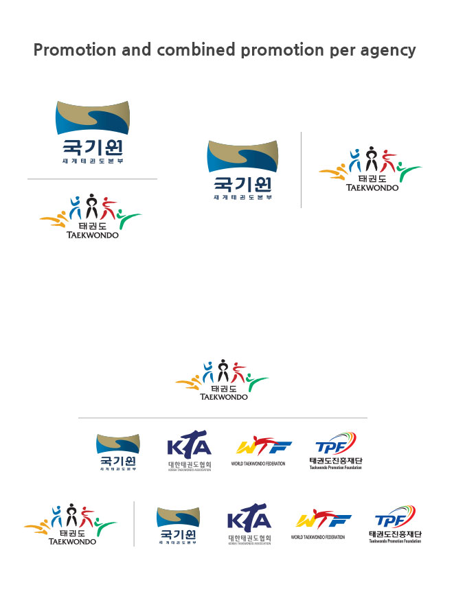
Regulations on the Combination of Related Agencies serve the purpose of organizing and effectively combining the Taekwondo brand and Taekwondo related agencies in an effort to actively unify images.


